


BIG NEWS
We have joined global agency TUX to expand our services.Learn More

Brand Positioning
Identity
Copywriting
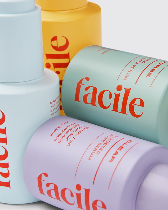
Packaging Design
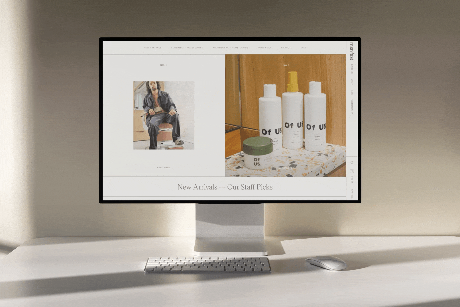
Website Design
Wayfinding
Art Direction
Full Production
Collateral Design

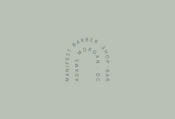
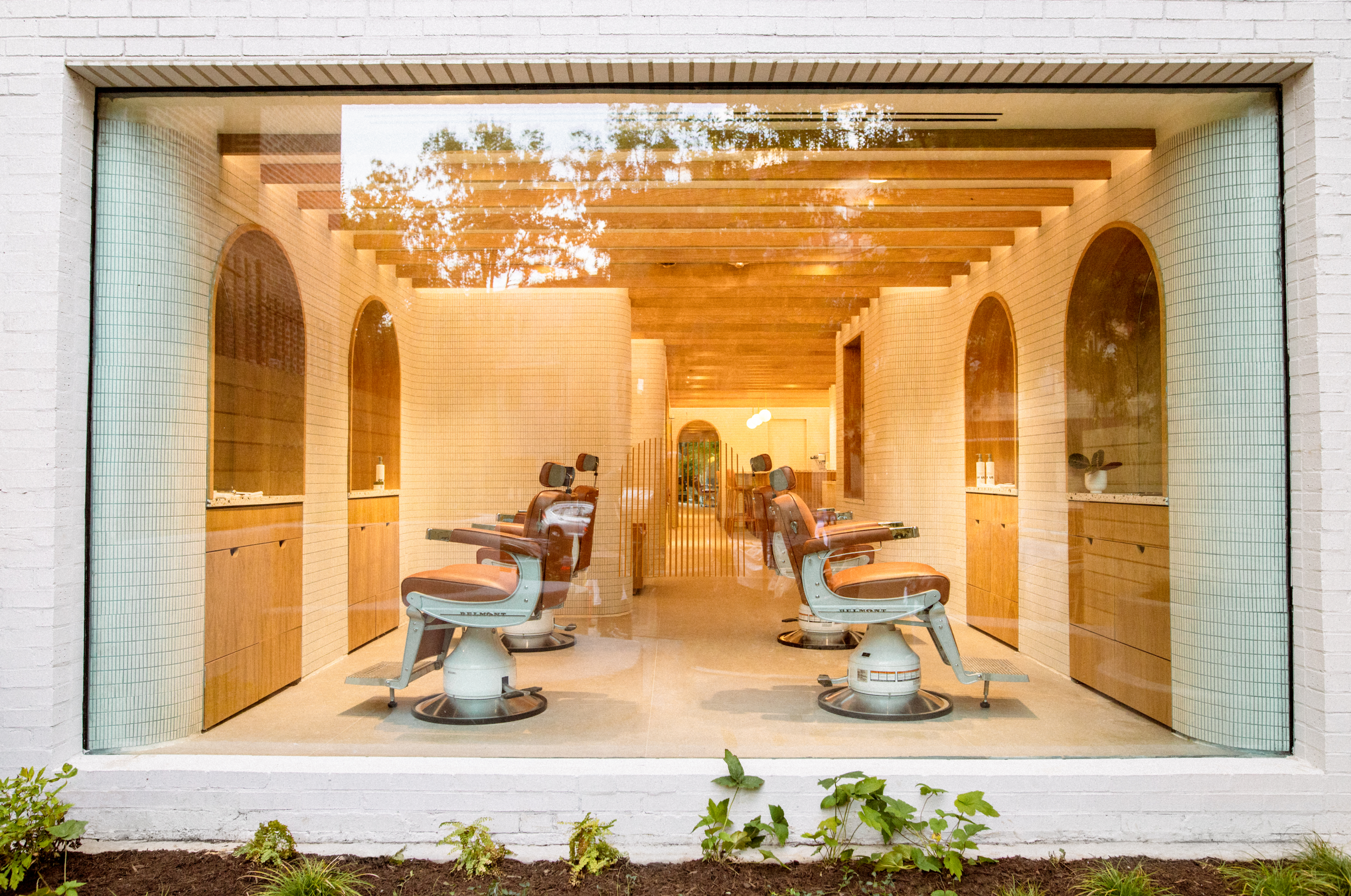
Archways can represent ceremonies of renewal in many cultures. Walking through an archway represents the sloughing off of the old and moving into a new phase of life. As you walk through within Manifest, we hope that you discover new things and new ways to heighten your senses through our offerings.
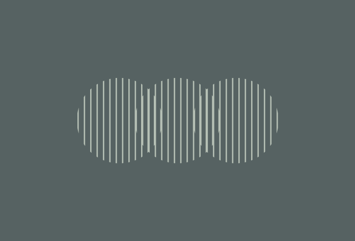
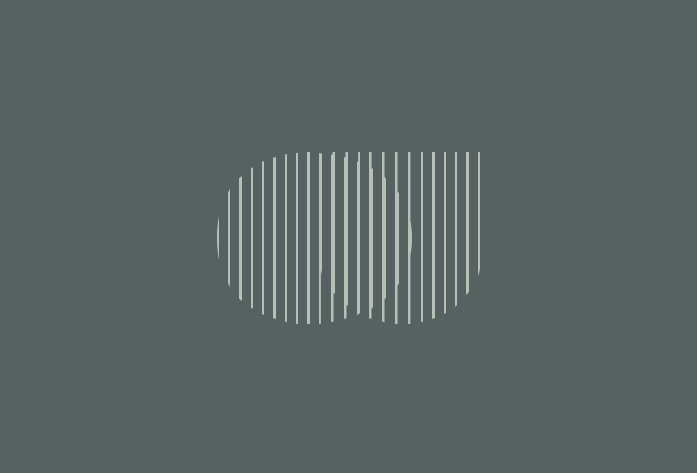
Linear elements aim to symbolize the community we intend to foster. A sense of community and connection through the gathering of ideas whether within the barbershop or cafe or bar.
Celebrating inclusion and a sense of unison. We connected to the craft of terrazzo and how it is made of different materials to add depth to a greater outcome. It ties to how at Manifest we are welcoming everyone from the community and want to create a sense of belonging for locals and those visiting.
Above: Architectural and interior design materials that inspired the final color palette
VIEW PROJECT
BIG NEWS
We have joined global agency TUX to expand our services.Learn More