


BIG NEWS
We have joined global agency TUX to expand our services.Learn More

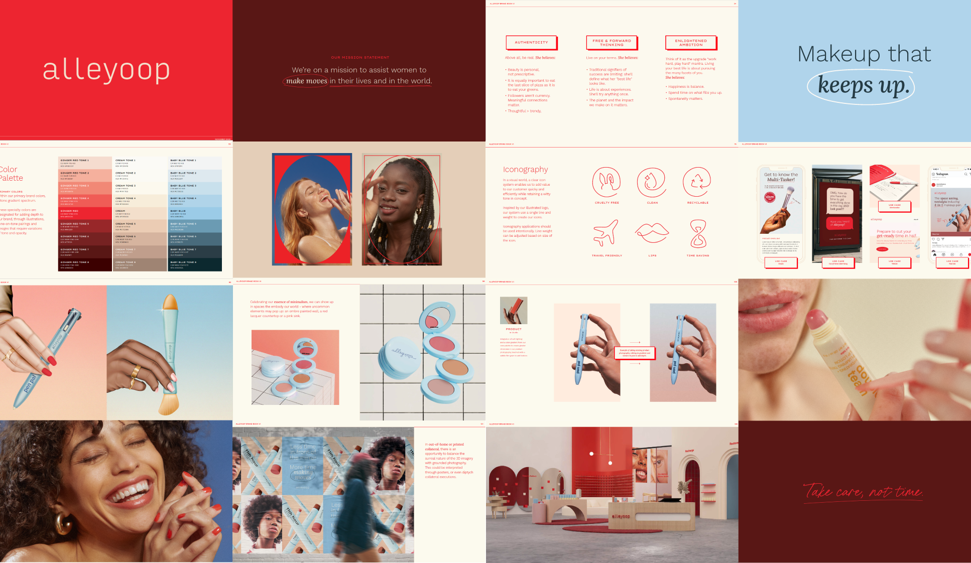
Creative Strategy
Brand Strategy
Brand Design
Brand Development
3D Design
Creative & Art Direction
Full Service Production
Photography & Film
VIEW PROJECT
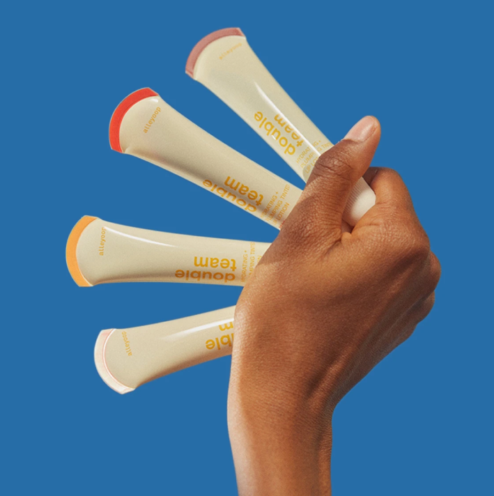
⟵ Osoa
VIEW PROJECT
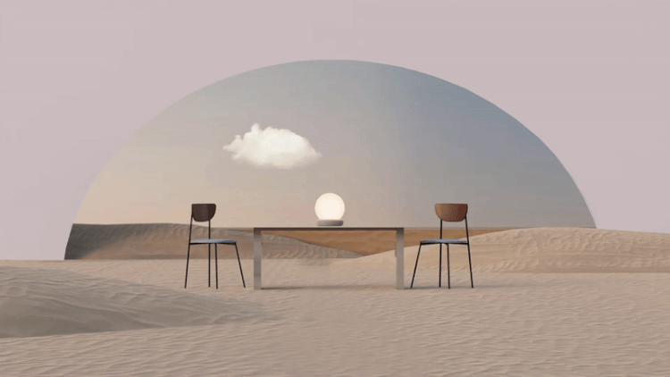
Tractor ⟶
BIG NEWS
We have joined global agency TUX to expand our services.Learn More